|
|
|
|
|
|
Litograph & color: for natural or better colors! color-corrections + creative-corrections + composing |
|||
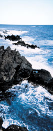
 shore |
 artist himself : ) |
If the colors shall look like the real product or even better -
or if the whole picture only shall look a bit more friendly -
it is always necessary that the demand of the customer
and the technical specifications of the printed media
are taken into account before considering what to do.
 azulejos |
 portugese tiles |
Through proofs and finetunig of pixels
we get a perfect result for the required application.
 fish-color |
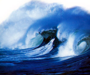
 wave |
Allready a photography can not show colors as found in real nature -
one of my most favourite jobs in the last millenium : ) was
final artwork for the bathing-collection of Triumph underwear.
After they had supplied all slides without any covers
and mixed into two plastic bags - organizers, scanner-operators
and litographers allready had given their best...
...we still had to tune the backround and the skin-tones of every picture
as well all colors of the bathing- and swim-suites had to be adapted
to the appearance of real samples layed out in front of us.
I did learn a lot about color-composing and litography with that Triumph job : )
 fire - CD cover inlay |
Of course I also can see that your print-productions go right
and I am interested in learning more about youre demand:
HERE you find my contact-form
or maybe you want to read once more from the beginning !
FINAL ARTWORK ILLUSTRATIONS
ADAPTIONS LITOGRAPH&COLOR
|
© 1995-2025 BK Grafik https://www.filmgeld.com/typesetting/litographcolor.html Kontakt Impressum Datenschutz |
|
BUNTEBANK Reproduktionen : Spielgeld & Spielgeldscheine Geschenkgutscheine Spielgelddollar Theatergeld personalisierte Spielgeld- & Dollar-Scheine von www.buntebank.de ° Spielgeldscheine von www.spielgeld.com ° Euroscheine von www.buntebank.com Spielgeld kaufen: Sortiment Sets oder einzelne Scheine Stückelung & Menge nach Wunsch. |
